Mortgage rates under various economic scenarios
2025-08-18
Mortgage rates just hit their lowest levels in nearly a year. With the market predicting the Fed to cut rates in September, how much further can they drop? Although much depends on both the Fed's decision and the overall economic outlook, we can use Daggy to build a model of how interest rates impact mortgage rates, then consider various economic scenarios to understand where mortgage rates are likely to fall under several economic scenarios.
I began by loading data from the Federal Reserve Economic Data (FRED) on the 2-year and 10-year treasury yields as well as the 30-year-fixed rate mortgage average into Daggy. The dataset included 812 weekly observations spanning from 2010 to the present. I then asked Daggy the following:
It ran several models and returned the following table:
Model Performance Comparison
| Rank | Model | R² | RMSE | WAIC | Key Insight |
|---|---|---|---|---|---|
| 🥇 | 10-Year + Yield Spread | 94.5% | 0.275pp | -34.4 | Best overall performance |
| 🥈 | 10-Year Only | 89.0% | 0.404pp | -276.4 | Missing the spread information hurts accuracy |
| 🥉 | 2-Year Only | 79.8% | 0.546pp | -512 | Short-term rates alone aren't enough |
Notice the R-squared of 94.5 percent shows that with just two variables we can explain nearly 95 percent of the variation in 30-year mortgage rates. The WAIC is used to predict how well the model would perform out of sample. Although this is difficult to interpret, AI tools like Claude know that higher values (those closer to zero) are typically better, so it can intelligently choose which model to use.
To further understand model performance, I then asked Daggy to provide me with the model's worst predictions, as follows:
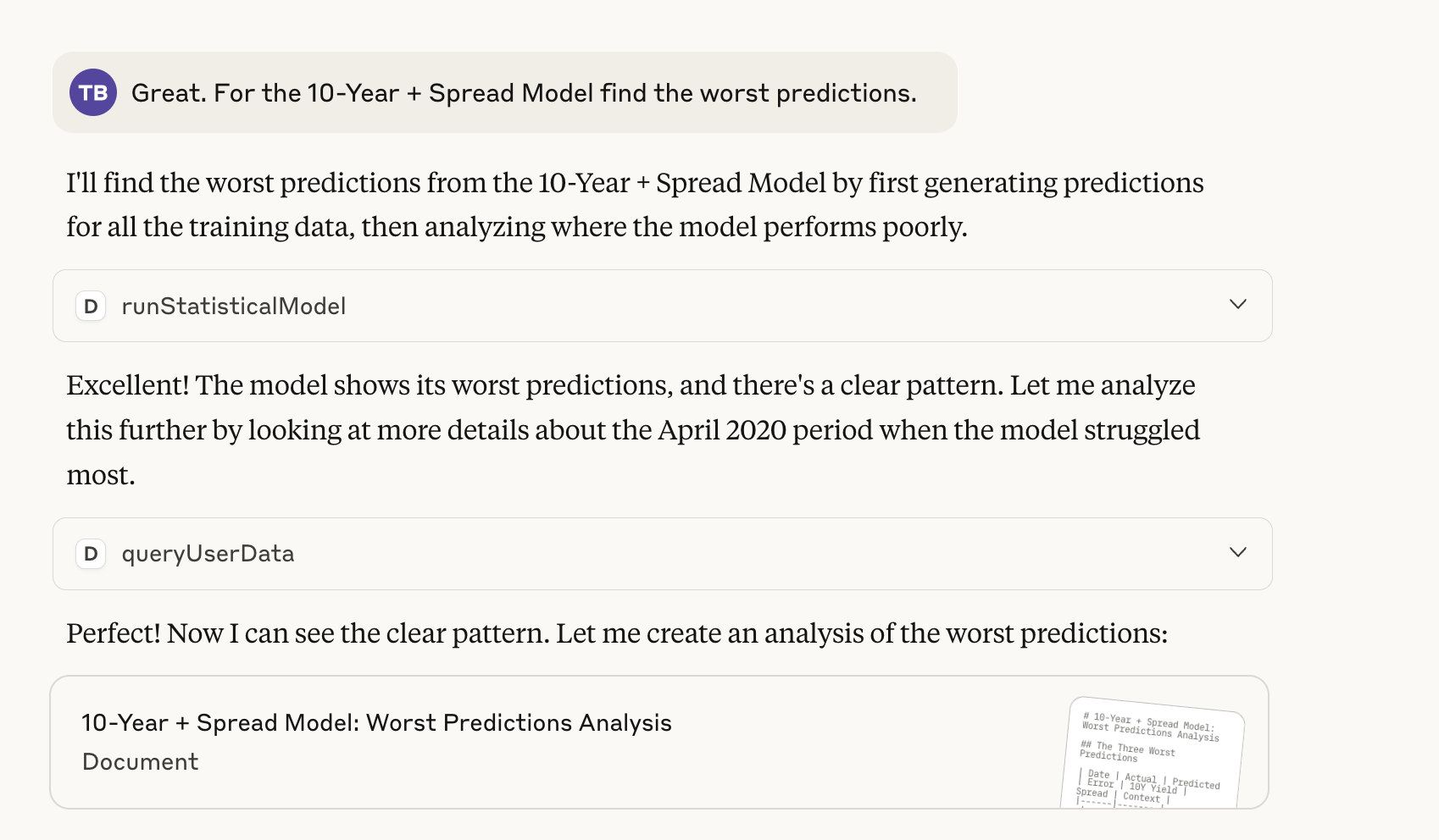
It provided an artifact that included the table below, showing that the worst results were well within 1 percentage point of the true value and occurred at the onset of the COVID pandemic.
Even During Crisis, the Model Holds Strong
| Date | Actual Rate | Predicted | Error | Context |
|---|---|---|---|---|
| April 23, 2020 | 3.33% | 2.5% | +0.83pp | COVID peak volatility |
| April 16, 2020 | 3.65% | 2.49% | +0.82pp | COVID peak volatility |
| April 2, 2020 | 3.33% | 2.52% | +0.81pp | COVID peak volatility |
The table above shows that even during extreme market turbulence, our model stayed within 1 percentage point of the true values. Given this robust relationship, we can now consider forward-looking scenarios. To do this effectively, we need to understand how different economic conditions shape the yield curve, or the relationship between the bond's term and its yield.
Outside of periods like quantitative easing (QE) the Fed sets overnight bank rates. Overnight rates then influence, but don't solely determine, longer-term rates like the 2 year and 10 year. Mortgage rates are closely tied to longer-term rates, which the Fed doesn't directly control. The yield curve's slope -- basically the difference between long-term and short-term rates -- is notoriously difficult to predict. Economic theory argues the slope depends on the market's expectations of future yields as well as a premium for holding longer-term bonds. Both of these factors are difficult to observe and can fluctuate based on many factors, such as expected inflation and unemployment. However, yield curve's rough shape can provide insight into the market's view on future economic conditions. Specifically, consider how the following expectations would shape the yield curve:
Inflation Fears Higher inflation means the Fed will likely need to raise rates in the future. Expectations of future rates result in a steep, positively sloped yield curve, where the ten year yield is much greater than the two year yield.
Recession Fears A slowing economy means the Fed may need to cut rates. Expectations of lower rates result in a negatively sloped yield curve, where the ten year's yield is less than the two year's. This is also known as an "inverted yield curve". An example of this occurred in August 2019, which saw the ten year at 1.49% and the two year at 1.53%.
Soft Landing/Normalization Because of the premium for holding long-term bonds, yield curves typically slope upward. But if investors steady rates, the slope will be flatter than in the inflationary fears scenario.
Economic Boom Typically economic booms are associated with higher interest rates, both because booms feed inflation and a higher demand for investment consistent with rosy economic outlooks cause rates to rise. This scenario results in a steeply sloped yield curve with the 10 year rate higher than the 2 year rate.
Now we can use our above trained model to determine a likely range of mortgage rates under these scenarios. I asked Claude the following:
Use Daggy to run a few scenarios here. For context, the current 10 year yield is 4.29% and the two year is 3.74% Then put this into a table. Let's think about broad economic scenarios: if investors expect inflation, we will have a positive sloped yield curve. If they expect a recession we will have an inverted yield curve. During normal circumstances it will be positive sloped, but less extreme than when investors expect inflation. We can also think about a stagflation and a boom.
and it returned the table below.
Economic Scenarios and Mortgage Rate Projections
| Scenario | Economic Expectation | 10Y Yield | 2Y Yield | Spread | Predicted Mortgage Rate | 90% Confidence Interval |
|---|---|---|---|---|---|---|
| 🔵 Current | Normal Growth | 4.29% | 3.74% | +0.55% | 6.52% | 6.33% - 6.71% |
| 🟢 Normal Growth | Steady Economy | 4.00% | 3.25% | +0.75% | 6.13% | 5.97% - 6.30% |
| 🔴 Recession | Economic Downturn | 3.00% | 3.50% | -0.50% | 5.43% | 5.26% - 5.60% |
| 🟠 Inflation | Rising Prices | 5.50% | 4.00% | +1.50% | 7.55% | 7.23% - 7.87% |
| 🟡 Stagflation | Inflation + Slow Growth | 5.00% | 4.50% | +0.50% | 7.32% | 7.06% - 7.58% |
| 🟣 Boom | Strong Growth + Inflation | 6.00% | 4.00% | +2.00% | 7.94% | 7.56% - 8.33% |
Without further prompting, it also provided a detailed analysis of the table. Two surprises it pointed out were the following (which I am quoting):
-
Recession vs Boom Spread: Despite recession having the lowest 10Y yield (3.00%), mortgage rates only drop to 5.43% due to the inverted yield curve penalty
-
Curve Shape Power: The boom scenario (6.00% 10Y) has higher mortgage rates (7.94%) than pure yield levels would suggest, but the steep +2.00% curve actually helps - without it, rates could be even higher!
It also provided more logic behind why we would see the relationships that we do. For example, it pointed out that during an economic boom high growth expectations typically drive up rates. But it also noted that the yield curve's slope also played an important role, noting that "Every +0.25% of additional curve steepness reduces mortgage rates by ~0.15%."
The model shows that should the market forecast a huge economic boom, or if inflation takes off, mortgage rates are unlikely to fall much further. But if it forecasts solid growth, or should we fall into a recession, then rates are likely to continue to fall.
Although predicting the future may be impossible, we can still prepare for it through scenario analysis. Here we were able to get a sense of how mortgage rates may evolve given different macroeconomic environments. With just a few questions, Daggy built and evaluated several models. It found a model that was extremely predictive with just two variables, then used that model to consider various economic scenarios to understand likely mortgage rates.